Feedback and change of website
Findability
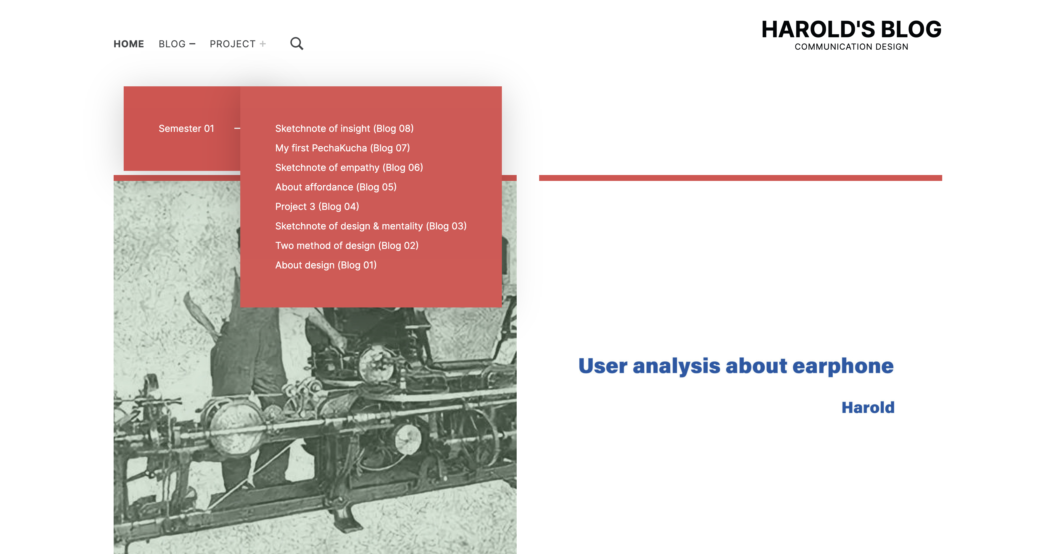
The display of the blog name on the menu navigation page is too simple, but the numerical order of the blog is marked (for example, blog1, blog2, blog3, etc). The user cannot get the blog theme from the information I give on the navigation page, which is very cumbersome and unclear for the user experience.
The layout of the homepage is rather messy, and users cannot quickly get the buttons where they can click to get more information.
Content
The title code is too large, which causes the title part to occupy too much area in some blogs with too long title characters, which is very inconsistent with the main part. The paragraphs are too close to look crowded.
Change
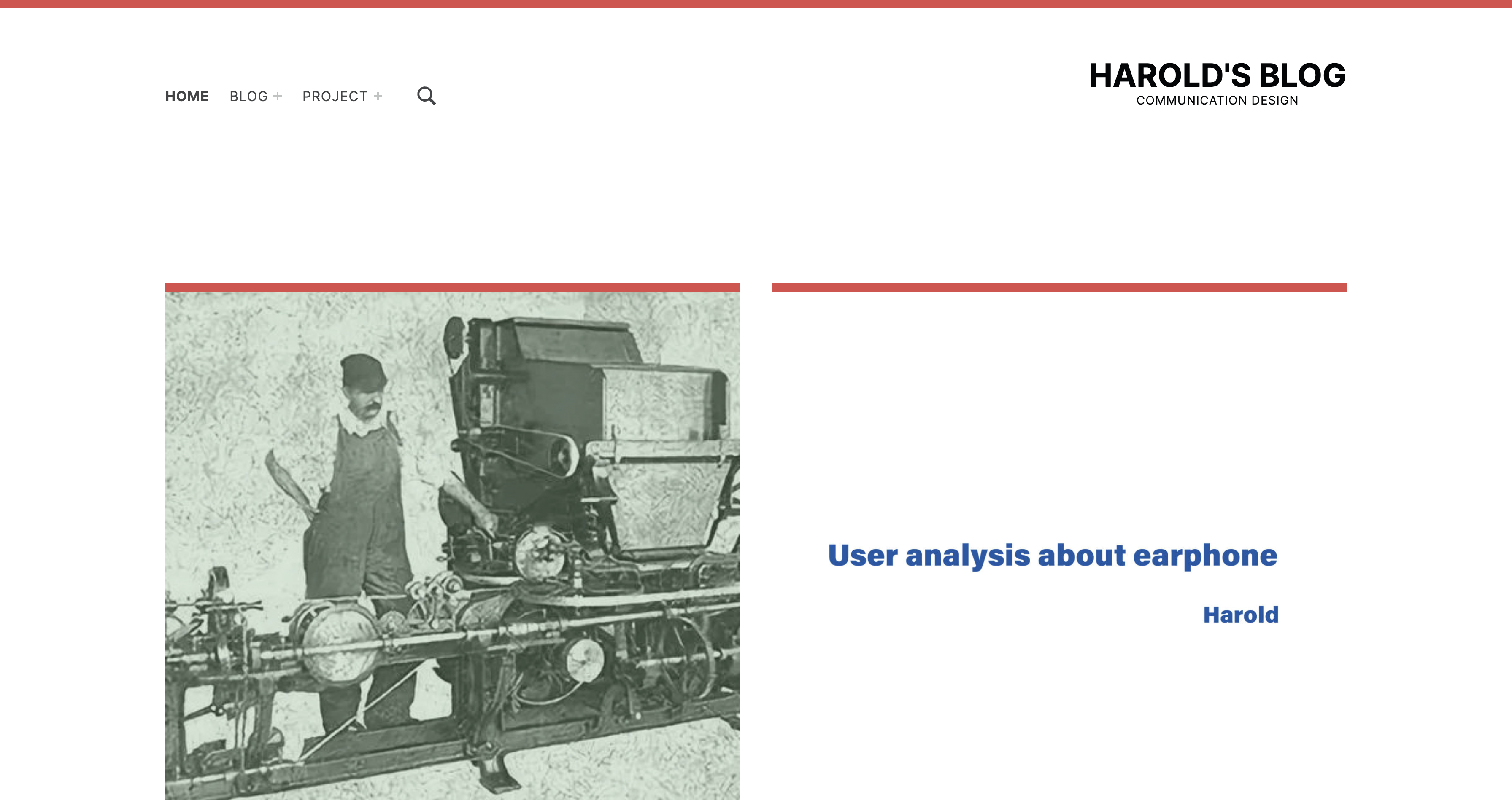
I changed the main interface. Featured pictures are inserted in the blog to help users have a general summary of the content of the blog. And changed the display of blog in the menu bar.
In the content of the blog, I re-typesetting, including changing the size of the title, the relationship between the picture and the text, and unifying the format of all blogs.
Finally, I changed the overall visual effect of the website to make the website look clearer and improve the user experience for users.